Sunday, July 10, 2011

Google+ and the killer app

Recently I was able to experience the newest addition to the Google family, Google+.

The general feel of the application is a stripped down version of Facebook. There are no farmvilles, no pokes and you don't see anyone's birthday. It's basically a stream (where you see what everyone's doing) plus one notable killer app - a hangout.

A killer app is the holy grail of software. It's the carrot that gets the donkey moving, it's the reaso

n to use an application. A killer app gives software value and lets an application, or in this case, a site build on it and grow.

A hangout, Google+’s killer app, is an interesting way to video chat. It allows the user that is speaking to take focus on the main video screen and show all the other participants in smaller screens below.

The hangout solves many of the video chat interaction problems that I

experienced within my studies of distance education. It allows a single person to take focus with the ability to view all others body (or at least face) language providing visual cues to let others speak. It also has all the microphones live unless the participant (or other viewers) mute them. It provides an elegant way to mute individual people and the software solves the feedback issues that have accompanied other application reviewed.

In short, when multiple mics were on, you would hear feedback of you speaking from other mics and produced many unwanted sounds. With this problem solved it closely equates to a bunch of people all speaking in the same room.

While the implementation was not flawless (I needed to restart multiple times during my chats) it did make for a very interactive session.

The main detraction of the hangout however is lack of friends.

When I was testing out this function I joined a hangout of a young lady I met through twitter. Becky is a social media maven, and as such has 500+ friends on facebook and has invited at least as many on Google+, making for an very interactive experience, where acquaintances, such as myself, were stopping by to say hi. At some points we had 6 people, who’s only connection was Becky and we all proceeded to chat away.

Contrast this with my 15 friends and you can see how empty a space can be for this feature.

I’m sure when developing this function it worked flawlessly, because this problem probably didn’t surface, and it would be hard to classify this as a 'development issue'. But for now, the killer app is a bit of a goose egg without lots of friends.

It would be great to have a ‘local tavern’ type of hangout, possibly by location or interest area to properly utilize this feature, but in the meantime you may want to find Becky and ask to be her friend. You can find her as one of my friends at gplus.to/dlumer

Friday, April 1, 2011

Usability on the street

Let's take a moment to consider the lowly street sign.

Traffic signs are deceivingly simple devices that lead users (or drivers) to the places they need to go. But what makes them so effective for the tasks.

When i was learning to drive in the United States they give you a little booklet with pictures of about 20 standard signs. As part of the written test you needed to have an understanding of what these signs illustrated to get on to the driving part.

But there are many more signs that we encounter on a daily basis than a simple 20. All these signs are categorized by color, shape and placement. Based on the combination of these three items the user first gets a basic understanding of what to do, and in some cases based on the iconography is conveyed a very specific message.


Consistency
Consistency is the key to making the whole enterprise work. Consistency is one of the more mundane principles of the user experience when dealing with websites or applications. Especially in today’s web 2.0 world where consistency is masked by the task you are completing. Consistency however allows the user to define their space and the boundaries within that space. If done correctly, a consistent nature in any design will disappear into the background because the lack of consistency is what is noticed in task completion.

When a user encounters a combination of shapes and symbols they immediately understand the context, and even if they cannot work out the iconography the context is often enough to alert the user. It is the consistency however that helps simplify the problem and increase reaction time.


Color + Location + Shape + Iconography
The traffic signage system has a limited color palate. Each of the colors used has a specific meaning, and are designed for readability and not specifically visual appeal. You won’t find and array of pastel colors for street signs, although it would probably dress up your standard cul-de-sac.

There are seven general colors used including green, red, blue, orange, yellow white and black. Of these we will concern ourselves with red, yellow and green, leaving the orange (construction), Blue (services), White, and Black (regulatory) for another conversation.

Red, most often associated in the United States with blood, war and danger, is at the top of the list. Stop, Yield and Wrong Way signs are all red. Yellow signs indicate a general warning. Green signs are directional, such as street signs and highway signs.

This same color orientation is carried through to traffic lights, indicating red for stop, yellow for warning, (or prepare to stop) and green for go. Color however is not enough. As in a traffic light, positioning is everything.

Color alone can be problematic. People can be color blind (10% of the male population is color blind), and signage can fade. Similar reasons have been used in application and web design against relying on color alone to denote changes. On the screen items may change by color but it is should be accompanied by thickness changes (bold) or underlined areas for links.


Color + Location + Shape + Iconography
Location has dual aspects - readability and consistency.

Street signs are positioned at the same height and location as you cross each intersection, their placement is strategic, and intended to be higher than obstacles that might obstruct them and be seen from a reasonable distance. The objective of any sign is to require a minimal amount of time to identify and understand their meaning. The color and placement act as the label to their function.

In fact, in the now cash strapped New York City the city spent over twenty-seven million dollars to rebrand all their street signs in lower case to improve the clarity of the message by making all the signs upper and lower case. Given the speed of traffic in the city (not to mention Manhattan streets are set in a grid) one wonders if this is truly the win intended.

Research has show that lower case letters are quicker to read. Some people save up to 16% of reading time. The justification for the change was that quicker reading can save lives, and avoid the danger of accidents if confused.


Color + Location + Shape + Iconography
Shape is the third category of the sign tripod. Shape combined with placement and color allows the user to classify the needed interaction, matching category to intended results.

There are 5 basic shapes for signs in use including octagonal, diamond, circular, pennant and triangular.

The octagon is a regulatory sign, informing motorists to do, or not do, something. This shape is exclusively used for stop signs. Because of it's importance and frequency of use, stop signs that are normally shown with white lettered "STOP" frequently can be seen in traffic symbols and popular culture without the lettering and is still instantly identifiable by shape.

Had this important symbol used for a multitude of purposes reaction time between identification and compliance would naturally be higher. This can be equated to the starburst symbol used in print advertisements. Use of a single starburst in an ad directly the user’s attention to the intended area. The starburst shape is unusual. It is uneven and generally does not blend into a page design. However, if multiple starburst appear on a page, the uniqueness is lost and the user’s focus in not as easily drawn to a single area.

The diamond is a warning sign. This alerts drivers to potentially hazardous road conditions. This is one signal that does not have the luxury of being identified by color (yellow) and its shape. This combination must also include appropriate iconography.

A rectangular white sign with green letters indicates that parking is permitted with restrictions but a rectangular white sign with red letters indicates that parking is restricted or prohibited. Parking signs, those that are attempting to convey messages that are day specific and time specific are particularly problematic to users. These signs combine the presented information with an outside factor such as time of day. As such these signs do not adhere to the usability principle of simplicity, every time you add something to a design, you reduce the visual clarity of everything else on it.

The textual and reading problem is seen with High Occupancy Vehicle (HOV) lanes on the highway that indicate when HOV lanes are in use. But what these signs fail to do is indicate what the normal use is outside of these day/time restrictions. Can you use an HOV lane outside of the core hours if you do not have two occupants in the car? To muddy the waters even more, energy efficient vehicles (regardless of the passenger count) can use HOV lanes in some areas. According to the California Department of Motor Vehicles anyone can use the HOV lanes outside of the stated hours.

Red, used to indicate danger is used in combination with circular signs and a slash are used to indicate the ‘do-nots’ such as do not enter, no u-turns, and no parking.

The pentagon, similar to the octagonal sign is used for warning specifically alerting drivers to watch for schoolchildren or pedestrians nearby. These signs are a fluorescent yellow-green for easier visibility in low light and foggy and rainy weather.

The triangle is a different type of regulatory sign that alerts drivers to slow down because another direction of traffic has the right of way. This shape is reserved exclusively for the yield sign. The yield sign has a white background with a wide red border and letters.

The success of the highway system lies in its consistency. In all 50 states, highway road signs look the same. Drivers don’t have to guess or interpret. They just use.


Color + Location + Shape + Iconography
What we understand about road signs and their meaning is localized however. The comprehension of which reduced significantly once we leave the confines of or area (in this case the United States).

Cross cultural studies on comprehensibility of traffic signs evaluated the comprehensibility of regulatory, warning, and traffic signs used in the United States with Mexican business and tourist drivers coming from Mexico. The results demonstrated that seven signs including Yield, Fasten Safety Belts, Right lane Ends, Load Zoned Bridge a response rate lower than 75%

The comprehension levels of locally used signs (78%) were much higher than that of non-local signs (32%).

This is where the iconography becomes important. Simple images for merging lanes and turning are easy, but it is much more difficult to convey STOP or YIELD when you cannot relay on the language to get across your message. Images unfortunately can have very personal meanings, which makes iconography difficult.

In web design you will often see buttons with icons on them a few of which will make perfect sense but the majority do not, forcing the use of a combination icon and words to get the appropriate message across.


In the example above, a standard stop sign is replaced with a stop sign with random letters. Users familiar with the stop sign will understand the meaning without the English phrase “STOP”. In the third graphic the word is replaced with an icon. Does the icon read as well as the text? It is difficult to determine without testing with users unfamiliar with a stop sign because users in the United States are bringing a level of domain knowledge (their past experiences with a product, or task) to the testing process.


Bibliography:

Traffic and websites, David Hamill
http://www.goodusability.co.uk/2011/02/traffic-and-websites/

The road sign metaphor, MICHAEL HISTEN
http://michaelhisten.blogspot.com/2009/04/road-sign-metaphor.html

Exit or Way out? - Road and other signs, Fanni Vig
http://bit.ly/dGwOWL

Usability and Internationalization: HCI and culture, Nuray Aykin
http://bit.ly/hAyfhm

Shapes of Traffic Signs & Their Meanings, eHow.com http://www.ehow.com/about_5435894_shapes-traffic-signs-meanings.html

Friday, June 26, 2009

Conference sessions that rock usability

I recently attended an industry conference on Rich Internet (RIA) technology that was billed as pertaining to the user experience (UX) folks, albeit loosely. While I attended the multi-day conference I was musing on what an ideal conference would be for people the work primarily in the usability/user experience/user centered design space.

To be fair, one of the primary criteria for attending this RIA conference was the proximity from where I work, while still getting some amount of useful knowledge. Budgets not being what they used to be, it has been increasingly difficult to make a case for travel to California or Florida; which are both popular conference destinations.

I’ve attended both UIE(1) and Nielsen/Norman(2) conferences for usability numerous times over the years, and while both Jakob Nielsen and Jared Spool are both engaging and popular speakers I’ve been to the big top and seen the show.

As a result I began thinking about a more user-generated curriculum by people who are not consultants but are embedded user experience people that not only solve problems on a daily basis but fight for usability resources, lab space and good user centered design in-house every day.

Believing that visualization is the first step toward action I’ve penned 10 conference sessions that would rock usability.


1. Selling Usability: How to get a budget and a staff in 12 easy slides

One of the largest issues that user experience folks have is actually selling usability within their organization.

Having attended many conferences, this question usually shows up in one of the Q&A sessions. Knowing that the questioner’s company has paid a boatload of money to send said person to the conference, the presenter points out this simple fact, says it’s a good thing, and then usually moves on.

What I would want is a way to make this more actionable.

I would envision this session as part work session and part presentation where the final deliverable is a set of PowerPoint slides you could take with you and use as a toolkit to furthering usability within your organization. PowerPoint has always been the coin of the realm in corporations.

Since every company is a bit different I would see a base set of slides with lots of metrics and quotes on how doing usability early saves money, and highlighting specific instances where well known companies saved money and how they did it.

As an interactive, user generated session; attendees would contribute slides and then speak to them as part of the group.

The end result would be an vast set of slides and talking points to further user centered design. This would be very interactive and very real, as well as providing a neat way to get introductions to people that feel your pain and fight the good fight.


2. Tools and Tricks to amaze and stun your friends
There are lots of ways to slice and dice the user experience and get information from your users.

This tools and techniques session highlights quick usability testing and methodology tricks to further usability by including users, stakeholders, and developers in the process in a fun and low risk way.

Two good examples that I personally picked up from Jared Spool’s podcasts are confidence indicators and 5-second tests.

The confidence indicator is simple way to gage how sure people are of what they are telling you. This is done in a non-judgmental way quite easily with poker chips. Simply put, you give a participant a set of 10 poker chips and ask them questions. The participants then indicate how sure they are of their answer by pushing some chips towards you. The more chips, the more confident they are of their answer.

Another example is 5-second tests(3) which is a simple usability test that helps you identify the most prominent elements of the user interface.

In this test you give a participant a quick look at a screen or printout and then take it away, after which you ask them questions about interacting with the page.

Quick hits like these are the allen keys and files in your toolbox. While they may never rise to the level of a hammer or saw, they have their place and are very useful. They are also easily explainable and low impact, meaning stakeholders won’t be threatened by it, hopefully opening the door to larger testing engagements.

This session would include 10 different methods tools and tricks with appropriate discussion leading to a lot of new stuff to add to the toolbox.


3. Rich Media, same as the old media?
One of my most recent struggles is how to effectively design and convey the user experience when the experience is not based on a static layout.

Screen design in the HTML world was, if not easy, it was well understood. The new crop of tools and interfaces such as Flash, Flex, Silverlight and AJAX change the playing filed and in many cased let developers to horrific things that look slick and finished.

Jakob Nielsen's “Flash: 99% Bad”(4) is a harbinger of what some designers and developers will do with a new tool that has lots of whiz-bang effects.

New media tools have their own visual language that makes effects very easy to apply and use.

UX people need to have an understanding of these tools, what they can and can’t do to be able to better illustrate the user experience.

It is difficult to recommend the best possible solution without knowing what your options are. With these new technologies it becomes easier for developers to produce slick, finished looking “prototypes” and as a result can sidestep all the knowledge that has been learned relating to user experience in the domain being developed in.

This session would highlight actionable techniques for illustrating dynamic media, and illustrate the UX functions and features within each of the target technologies.


4. Getting Published and the size of the rocks they throw
There is a lot of good work that goes on that unfortunately most of it does not make it out into the mainstream, making it difficult to advance the field.

This session would discuss and map a path of how to get published, the venues for publishing and the pros and cons to each publishing stream.

Also discusses is how to join new and interesting open source development projects(5) to help improve usability and raise your personal awareness level within the industry.


5. User Testing is about the user
Traditional user testing can be time consuming and a daunting task if you have never run tests before, but they don’t have to be.

This session takes attendees through the entire process for testing inside a corporate environment and outside in the public.

How many people do you really need to test with? How many tasks are too many? How can you get employees to participate in tests? When should I lead my users when they are stuck? These are just some of the questioned to be answered are each step in the process is outlined from facilitators that run tests on a daily basis.

Developing test scripts, determining the right participants, monitoring tests and keeping stakeholders in the loop, running tests and highlighting results successfully are all important touch points in the process.

Included in the session would be snippets from user tests (good and bad), highlighting techniques for facilitators and how to avoid pitfalls that can skew test results.


6. What’s YOUR problem?
Interaction design problems are mulled over and tested every day. For every problem there can be a series of comparable solutions.

Presented are multiple solutions to sets of common UI and information presentation problems in an interactive discussion and presentation format. Session participants would be requested to submit examples and work product that lead to their solutions and what they learned along the way.

This frank look at problems and solutions would lead to developing heuristics(6) and design patterns(7) that could be extrapolated solve larger layout and navigation problems.


7. Content, Search and other evil things
As intranets, extranets and general sites mature content is continually created, edited and sometimes replaced. Content owners both maintain and abandon their content as job responsibilities change and people move on from companies.

This session discusses how to manage content through its entire lifecycle and how to sunset old content and bubble up good content through content management, mining search and editorial review.

Content management, workflow and best practices are discussed with thoughtful examples from commercial software, homegrown, and open source content management applications; blogs, wikis and other user generated content sources.


8. Sharpening the Stick: Improving core competencies
Content Heuristics are well known but how can you present the application of heuristics in a meaningful, actionable and persuasive way?

How can you best facilitate card sorting(8) with a room full of type-A personalities or run tests across the globe?

When is the best time to use focus groups and who should you include in the process?

Do you use wire frames to illustrate user flow, and do they need to be more than doodles on napkins?

Heuristic evaluation, card sorting, focus groups and wire framing are all techniques used on a continual basis. This session discusses what you can do to make your techniques and results more effective, easier to produce and more persuasive to developers and stakeholders.


9. Content Governance and Style Guides & Frameworks, oh my
As organizations mature there are an ever-growing group of content providers including internal resources, third party vendors, integration groups and even interns.

Content governance(9) is a process where web content from diverse groups in a organization can be best harnessed for the betterment of visitors and to best use the available resources throughout an organization.

This session discusses how content governance plays a role in keeping the org on track, where, when, how and why to use style guides and frameworks and the problems and benefits to a structured environment.


10. Research and Resources: The truth is out there
Unless you work in a consultancy there’s a large chance that you are the only user experience person in the building or, if you are lucky, part of a small (maybe 2-3) handful of folks doing user centered design.

There are many resources from books, podcasts, websites, articles and even twitter friends(10) out there that can come to the rescue. This session highlights some of the best and provides a takeaway of resources so you can put together your own resource library and support group.


I hope you’ve enjoyed conference sessions that rock usability. As you see from the list there are many tool based sessions, research and solution based sessions but they all have a reoccurring theme of interaction between user centered practitioners to not only present ideas and solutions but the recharge the creative and analytical batteries within a common guild.

Hopefully it was interesting and thought provoking spurring a wealth of conference session to come to a location near you or me or simply on the Internet.

If you do plan of developing sessions in part or in whole please give me a shout out, and maybe even a free pass.


Bibliography:

1. User Interface Engineering (UIE)
Consulting firm and conferences headed by Jared M. Spool

2. NN/g : Nielsen Norman Group
Usability consulting, training & user experience group, Jakob Nielsen principle.

3. 5-Second Tests: Measuring Your Site's Content Pages
Christine Perfetti & UIE

4. Jakob Nielsen's Alertbox: Flash: 99% Bad
Original Article on Flash

5. Design in the Open
Open source development projects

6. Usability Heuristics for Rich Internet Applications


Labels: ,

Tuesday, July 8, 2008

Designing the web experience for children.

David Lumerman,
Lil’ Fingers Storybooks.

Small children offer a very specific challenge to experience designers because they use websites differently then pre-teens, teenagers and adults. In fact, usability research with children has often been considered either too difficult to carry out with unruly subjects, or not necessary for an audience that is satisfied with gratuitous animations and funny noises[1].

Children five and under explore the web through guided discovery, looking for large visual cues like clickable maps and bright colorful graphics. They will click around looking for fun and interesting things to happen when they move their mouse. This is different than their older siblings who seek out and identify with cool looking graphics. Kids are keenly aware of their age and know what is designed for them, and what is designed for their younger siblings[2].

The “sense of scent” [3] popularized by Jared Spool , where users will follow visual cues to get to their goal like little breadcrumbs, manifests itself differently in young children. Where adults skim text for key words or ideas that match the expectation of what they are looking for, young children without developed reading and writing skills will gravitate towards pictures, icons, colors and graphics to build mental models of the world around them.

Color and graphics becomes a much more important to designing the experience. This can be seen when children from an early age identify with familiar icons and associate them with complex words or ideas. What child cannot identify the golden arches of McDonalds (red and yellow letter M), the script Coca-Cola logo (red letter C) or the graphic on Superman’s chest (red and yellow letter S)? All of these pose strong iconography and primary colors.

Studies with kids done by Microsoft[1] indicate designing icons meaningful to kids, and even styling the cursor to be more kid friendly to indicate the tasks to be performed and provides specific visual cues which to adults, would be gratuitous. Examples of such cursors would be graphically stylized magnifier glasses indicating zoom functions and paintbrush icons.

Children, especially young children, love and identify with characters. They can identify and derive comfort from them, and from an educational standpoint characters aid young children in the learning process[4]. As much as adults detest “Clippy” from the Microsoft suite of products, young kids love these types of characters. The enjoy interacting with them, and they in turn help them perform tasks.

Along with color and iconography, interaction points need to be findable by small hands. Fitts’ law[5] indicates that the larger and closer the target area, the easer it is for a user to navigate to it. This is especially true for curious children who may not have the dexterity and fine motor control of their older sibilings. For this reason larger more obvious target areas make for better clicking.

Buttons that look like buttons produce better results in all age groups, but take on a different meaning for youngsters who rely more heavily on icons and do not have a full understanding of general internet conventions that are learned by repetition and experience when using web sites habitually.

Studies by Jakob Nielsen[2] found that “children are incapable of overcoming many usability problems, this combined with kids' lack of patience in the face of complexity, results in many [children] simply leaving websites”.

Underlined blue links that take you from page to page, left navigation to traverse a site’s taxonomy, clicking logos to go back “home”, and advertising banners that take you “away” to a new site are not easily understood by young children, and as a result cannot be used as effective navigational tools.

In fact, banner ads pose a particular problem because children do not see these as separate from the experience, but as part of the experience. As a result, they are more apt to click on banner ads.

Another item to consider with young children is a shortened attention span. This means that not only should activities be fast loading and easily accessible but should be short in duration, and if possible be savable or recoverable to the point where the youngster last lost interest. This is mostly for the adult’s sanity to avoid replaying the first few activity sections over and over again.

Because of this limited attention span, instructions need to be short and memorable. Adult users don’t read long on-screen text item, children in contrast, may not understand or remember them, so short and sweet increases task completion.

Sound and music is also something that distinguishes this group from older users. Small children are generally delighted when their movements cause beeps, bangs and snaps. Their parents however, not so much.

Because of these limitations many websites are designed with co-discovery in mind where the heavy lifting, such as navigation and activity selection, is done by someone old enough to easily circumnavigate these pitfalls, leaving the activity horseplay to the kids.


Author

David Lumerman has a graduate degree in Human Computer Interaction (HCI) from Rensselaer Polytechnic, and for the past 10 years has developed Lil’ Fingers Storybooks (www.lil-fingers.com), a online computer storybook and activity site designed for young children.


References

(1) Hanna, L., Risden, K., Czerwinski, M., Alexander, K. The Role of Usability Research in Designing Children’s Computer Products. 1998. Microsoft Corporation. Online: http://research.microsoft.com/~marycz/druin98.htm

(2) Nielsen, J., Kids' Corner: Website Usability for Children. 4/2002. Jakob Nielsen's Alertbox. Online: http://www.useit.com/alertbox/children.html

(3) Spool, J., Designing for the Scent of Information. 11/2004. User Interface Engineering. Online: http://www.uie.com/reports/scent_of_information/

(4) Blowers, H., Bryan, R. Weaving a Library Web: Guide to Developing Children’s Websites. American Library Associations. 5/2004; pp 71-73

(5) Fitts’ Law. Wikipedia. Online: http://en.wikipedia.org/wiki/Fitts_law

Labels: ,

Tuesday, January 8, 2008

The usability of Twitter

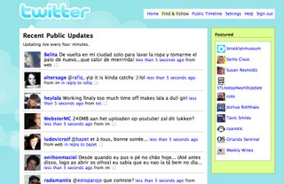
Twitter is a social networking site that allows users to broadcast small snippets of text to the twitter universe and your own small subset of this universe for friends and lurkers to read your posts. Posts are presented in chronological order with the newest posts on top and older posts fading off the page.

Twitter is crack presented to the blogosphere. But what makes it so addictive has a lot to do with good usability. Presented below is what twitter does right for the user and why it matters.

1. Immediate satisfaction
Twitter updates live every four minutes and hitting the refresh gives you new content immediately.

Posting is also as simple, usually showing up within seconds of posting, which then gets appended to your “recent” list.

2. Positive Identification
It’s not enough that text from friends and strangers parade across your screen, but there are photos associated with these text posts. Seeing the photos makes you want to read the text. It is no surprise that pretty young girls who post quirky interesting snippets have lots of followers. arielwaldman and kitta are followed partially because they have pretty faces and partially because of their interesting prose.

On my twitter (dlumer) I have numerous friends that have an associated photo and a few that don’t. I find the ones that have photos more interesting to read, even though what they type may not support this tendency. People like that human connection. They gravitate towards it.

3. Low cost of action
Twitter lets you collect friends easily. Simply by clicking on their icon or name you can “follow” them simply by clicking a follow button. There is no long process. It is very easy; making is easy to collect lots of friends or pseudo-friends. These friends can reciprocate just as easily and follow you.

Once the two-way communication is going, you can easily post back and forth in an ongoing dialog, like a party line that nobody hangs up on.

4. My Network, not your network
While you can surf the public timeline, the power of twitter is in the local network that appears as all your and your friends’ latest entries with the icons of people you specifically follow. This is the important “web 2.0” part, where the user is looking a collection of posts they assemble, not one based on groups like a mailing list. Each person’s twitter is unique to himself or herself, only containing the people you choose to follow – or “listen to”. If someone posts too much or turns out not to your liking, you can simply stop following them.

5. Context is king
Along with your specific view is the idea of context of the text. It is not enough to know a friend has posted, but it helps to know when, and sometimes how. Twitter has both, showing the messages with how long ago they posted and what type of device (web, txt message, applet) delivered the message.

From a systems perspective, the time requirement is satisfied by simply time stamping each entry. But from the user’s perspective it is much more important to know how long ago from this point in time a message was posted.

Approximate times are even better, because they are concepts easily assimilated. Knowing that a message was posted “about 3 hours ago” is infinitely more usable than knowing a message was posted at 4:34pm on January 8th. In the first instance the user must do a mental calculation for not only the date and time posted, but also the current time as well, to get to the same place as “about 3 hours ago”. If the cognitive load is greater than the information gained, the user generally disregards the mental calculation.


There are a couple of instances where Twitter falls down however as they try and balance the ease of use and information overload. The below presented information is not as much cut-and-dried criticism, as problems or opportunities for further refinement.

1. If a tree falls in the forest...
One of the largest holes in twitter is the inability to point messages to people who do not follow you. There are many instances where you follow someone, and read a post where the poster has asked a specific question to the group and you respond to that post – but the original poster never sees it because the don’t follow you.

Understandably there are good reasons to not allow just anyone to post to anywhere. You need only look in your email box’s spam filter for hundreds of reasons. The problem I see however is the lack of feedback that the message will never be seen. While I have no hard data to confirm this, the anecdotal data I have is based on peoples various posts, when they realize that they are missing out on posts and begin following people who have responded to them.

Additionally, the system does not have an in system way to “poke” a user, letting them know you are responding to them.

2. My message is bigger!
Twitter is designed for short bursts of message content. This message content may be a bit on the small side for many users. Many a time you get posts broken into 2 or 3 messages to get the whole thought out. This may be the extreme example, but I personally would love about 20 more characters most of the time.

To Twitter’s credit however they dynamically show you how many characters you have left in your message, and even visually change the display when you are about to run out of space. This is a tremendous step up from instant messenger’s “your post is too big so you are out of luck” message.

As you can see, overall twitter is a great assemblage of micro-blogging and social networking that allows people to easily stay in touch with others, and isn’t maintaining the human connection with computers what it’s all about?

Labels: , ,

Thursday, August 9, 2007

Usability of Social Networks (LinkedIN)

The cornerstone of user experience is the trade off between what you are required to do and what you get for doing it. In the case of social networks, what you get can be significant, so much so that the user is willing to go through multiple steps to optimize the experience.

LinkedIN
One such network is LinkedIN. LinkedIN, for those that do not know is a social network to build and maintain professional contacts. The idea is simple. I know people, you know people, and these people know people, forming a network of associations.

LinkedIN is a good example of a social network web application. Here are some highlights (and a couple of dings):

GOOD: Low barrier to Entry
New people can be added to the system easily with only entering a couple of pieces of information. This allows the user base to grow and develop without full profiles.

This is generally one area where software development gets it wrong most of the time, looking at each user as a record, and each record should be as complete as possible, this makes the linkages of data easier for the programmer.

Unfortunately this creates a high barrier to entry where most potential contacts would bounce off and not be included in the network.

I recently began using this service, and I have a few people with only one contact (me) and only info about the associated company.

Making it easy to have incomplete records makes it easy to exploit these new semi-users in the future.

GOOD: Keeps the user informed about other contacts
LinkedIN also has a nice feature to show what your other contacts are up to. If a contact added a new connection, or recommends someone then it shows on your control panel, keeping you informed.

GOOD: System Status
There is a status area showing how complete your profile is. This allows you to take the next step in the process, making the record more complete. This makes the programmers happy and enhances the overall network. It also helps convert semi-users to habitual users by indoctrinating them slowly into the site.

GOOD: Graceful Security
The application will lock the user out after a pre-determined period of time. This has become standard for secure applications. What is not standard is doing it gracefully.

Many applications will time-out forcing the user to re-enter credentials and then either reset their session to the login point or take them to where they were last, losing their edits. The LinkedIN system is smart enough to retain your edits, log you in and then complete the process. Very sweet.

BAD: Editing Previously Entered Information is Difficult
While some of the entries have [edit] links, many do not. In fact this is an instance where an edit link is detrimental to the user.

The edit link next to only the current contact (and not other contacts) makes the other contacts appear in-editable.

Other contacts are viewed in their completeness with edit links, but this is below the fold(you need to scroll to get there). Because of how the layout appears to have footer information (an ad to link out to your public profile on your personal website) giving the impression that there is no more information below that point.

By changing the [edit] link to link to lower on the page, they could inform the user that these items are easily editable.

BAD: Tab Woes
The labels on tabs in the application can be a problem. While most are straight forward, the ones for the profile are confusing. Similar names do very different things. "Edit my Profile" is simple, and allows the user to edit the profile. The "Edit my Public Profile" gives the user the impression that they can have two distinct profiles, one for the public and one for friends/colleagues. This is not the case, this option simply allows the user to show and hide profile sections.

It would be better to call it something different, possibly profile preferences.

BAD: Profile Differences
Related to the tab woes is the way the profiles are displayed for your personal contacts and for you viewing your contacts.

The interface tabs change depending on who's details you are viewing. Keeping this consistent would allow the user to seamless jump between the two.

While not a big deal, it does add to some jumping about to see things like recommendations.


Social Networks in General
Social networking is akin to a video game where the user hunts for the prizes and adds them to his bag of goodies and continues to forage. LinkedIn propagates this by showing your contacts and your contacts contacts putting you in a virtual death match of adding to your network.

Social networks are the new version of the social club or local pub where you can keep in contact with others, if only virtually.

Friday, July 20, 2007

How easy is it to print?

This article is for those of you who have been hardened on word processors for what seems like your entire life.

To you, the idea of having trouble printing is nonsense. Printing is one of the core functions on a computer. In fact, when you first got your Commodore 64 one of the only things it could do was print, so when I say that printing is hard, you should find it hard to believe. But it is.

Last evening I spent about 45 minutes with my father trying to guide him to print a document from Microsoft Excel. Now, my father is not a dumb man, he may be a bit on the technology light side, but in general he can navigate around pretty well. But, when he needed to print his document so columns were not being cut off he was lost.

Step 1: Hidden Options
Starting from the beginning, Microsoft has decided to hide options at random from menus. So, to print, you can’t simply select “print”, first you need to expand the menu to show all the menu options. Not ideal, but definitely doable.

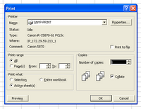
Step 2: The print menu
You might think this is where our story begins and ends, but on the general print menu there is no option to change the print orientation. This is odd, since most pages are set up portrait orientation, but most spreadsheets are landscape orientation.

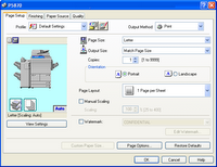
Step 3: Properties
The properties option contains our orientation menu, along with a host of other options, most of which would confuse my poor father. The problem here is there is no preview to see if your data fits on the page. And, there is no easy way to get to the place to see the data (the previous screen), so you need to click ‘ok’, then preview to see the result.

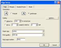
Step 4: Clicking preview
If the preview is not to your liking, there is a handy “setup” link, which, you would think, would lead the user back to the complication whence you came. But alas, is brings you to a different ‘setup’ menu.

Step 5: Send the file to me and I’ll fix it.
In then end, my father was not able to print his spreadsheet in its current format for many reasons. Some of which were technical and some because he did not have the knowledge of Excel to make the modifications necessary to fix it.

While many of us have reached the point of Excel wizardry in reformatting screens to our liking, I would suspect there are just as many who are confused and end up taping together multiple print outs unnecessarily. To this, I say the failure is in the system. The system should be smart enough to know the orientation of the document and be able to change (or suggest to change) the orientation to our needs. The system should also make it simple for the user to find commands, and present the most used options in a single location without the need to navigate several screens. Additionally, the system should make it easy to navigation to a single representation (one view) of user options and make it easy to go back and modify them without the need to guess or start over.

And the user... well, the user should learn how to use Excel.