Elevator Usability
At first glance you might think that elevators are pretty usable form of conveyance. There are however many circumstances where the usability of an elevator may be in question.
The use case is simple.
Apparently this is a real problem for some people. My favorite is a site called elevatorrules.com, which contains written rules and comments on how to use the elevator. These include requesting passengers who are going up or down a single floor to take the stairs.
The simple decisions necessary to determine if you should enter an elevator become complex based on the affordances (things to make using something easier) built around the elevator and what you find before entering the elevator.
In simple terms, if it’s full, you don’t get in. If people are getting out, you let them before entering the conveyance. It is surprising to observe how many people get this part wrong and stand directly in front of the elevator when the doors open. Unfortunately for the people leaving the elevator the person looking to enter has given little thought to the onslaught of people exiting. This Moe can either act as a bowling pin and get knocked aside by the exiting passengers or as the bowling ball (which is more common) trying to get into the elevator before passengers leave.
On the elevator there are visual cues to the floor you are going to. These are usually indicated a lit up number, or in the newer displays, an 8x10 video display combined with an auditory message of the floor arrived at, and sometimes the direction you are traveling. All of these are designed to facilitate the entrance and egress process.
There is no part of the use case that has more problems that the simple decision of choosing to go up or to go down. The decision is simple, but the visual indicators are the area where design liberties are taken, and as such may not be the most usable.
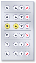
One of the most often seen indicators is the lit up arrow, which combines two visual indicators, the first of direction, and the second of selection. By using two methods of indication, recognition is easier for riders, and usable for colorblind and the visually impaired.
The least usable versions seen are the ones developed in the 70’s and designed to be hip and sleek. These utilize only a single light and two colored bulbs - one white, and one red. Unfortunately, color alone is not a good indicator of direction, even if these indicators are for heaven (white) and hell (red). These indicators become even less usable as time goes by when the frosted glass panes used to cover the bulbs are not regularly cleaned, making it all look grey. This forces users to guess as to the direction of the conveyance, a process the would-be passenger is doing standing right in front of the elevator asking, “is this going up?” to people who are already annoyed that you are standing in front of the elevator while they are trying to get out.
In fact, even Superman had problems with this as parodied in the 1978 “Superman the Movie” as Clark Kent trying to get to the lobby stood right in front of the doors to the ire of the passengers.
Even the buttons in an elevator are fraught with indecision when the standard ‘L’ or ‘1’ buttons are replaced with an ‘M’ which may or may not be where you are headed.
Common user errors in an elevator happen when passengers push the wrong button, or get off (or not get off) on the correct floor. These are usually followed by a sheepish look by the offending passenger, telegraphing, “What, it wasn’t me who pushed ‘7’, it was some other guy who got out at ‘4’.” Errors can also due to mechanical problems. Burned out lights behind buttons deprive the user of the visual cue that the system is aware that you have initiated action, leaving the user to press buttons multiple times.
Modern developers have actually looked at improving the time-honored elevator system to improve efficiency by placing a panel outside of the elevator to indicate the floor the passenger wishes to go to before the elevator arrives. When the user enters the elevator, it knows where to go. This is a remarkable system for habitual users, but for visitors it is a new learning experience. Many a time I have observed delivery people walking into these elevators only to find there are no buttons to press, and then being at a loss as to what to do.
 It is surprising that these developers have not tried adding a cancel button and directional buttons next to each floor button, because as we all know, sometimes you might just want to change your mind.
There are times when inefficiency can actually be more efficient.
The use case is simple.
- The user wishing to go up (or down) pushes a button to indicate to the system that a passenger is waiting. Based on the other passengers waiting on various floors the elevator eventually arrives to retrieve the passenger.
- The doors open and existing passengers get out, the new passenger gets in to the appropriate elevator (if there are multiple elevator cars).
- The passenger depresses the button corresponding to the floor of his or her choice.
- The elevator stops at all floors corresponding to buttons that are pressed between the current location and the final destination.
- When the passenger arrives at the destination requested they exit the elevator.
Apparently this is a real problem for some people. My favorite is a site called elevatorrules.com, which contains written rules and comments on how to use the elevator. These include requesting passengers who are going up or down a single floor to take the stairs.
The simple decisions necessary to determine if you should enter an elevator become complex based on the affordances (things to make using something easier) built around the elevator and what you find before entering the elevator.
In simple terms, if it’s full, you don’t get in. If people are getting out, you let them before entering the conveyance. It is surprising to observe how many people get this part wrong and stand directly in front of the elevator when the doors open. Unfortunately for the people leaving the elevator the person looking to enter has given little thought to the onslaught of people exiting. This Moe can either act as a bowling pin and get knocked aside by the exiting passengers or as the bowling ball (which is more common) trying to get into the elevator before passengers leave.
On the elevator there are visual cues to the floor you are going to. These are usually indicated a lit up number, or in the newer displays, an 8x10 video display combined with an auditory message of the floor arrived at, and sometimes the direction you are traveling. All of these are designed to facilitate the entrance and egress process.
There is no part of the use case that has more problems that the simple decision of choosing to go up or to go down. The decision is simple, but the visual indicators are the area where design liberties are taken, and as such may not be the most usable.
One of the most often seen indicators is the lit up arrow, which combines two visual indicators, the first of direction, and the second of selection. By using two methods of indication, recognition is easier for riders, and usable for colorblind and the visually impaired.
The least usable versions seen are the ones developed in the 70’s and designed to be hip and sleek. These utilize only a single light and two colored bulbs - one white, and one red. Unfortunately, color alone is not a good indicator of direction, even if these indicators are for heaven (white) and hell (red). These indicators become even less usable as time goes by when the frosted glass panes used to cover the bulbs are not regularly cleaned, making it all look grey. This forces users to guess as to the direction of the conveyance, a process the would-be passenger is doing standing right in front of the elevator asking, “is this going up?” to people who are already annoyed that you are standing in front of the elevator while they are trying to get out.
In fact, even Superman had problems with this as parodied in the 1978 “Superman the Movie” as Clark Kent trying to get to the lobby stood right in front of the doors to the ire of the passengers.
Even the buttons in an elevator are fraught with indecision when the standard ‘L’ or ‘1’ buttons are replaced with an ‘M’ which may or may not be where you are headed.
Common user errors in an elevator happen when passengers push the wrong button, or get off (or not get off) on the correct floor. These are usually followed by a sheepish look by the offending passenger, telegraphing, “What, it wasn’t me who pushed ‘7’, it was some other guy who got out at ‘4’.” Errors can also due to mechanical problems. Burned out lights behind buttons deprive the user of the visual cue that the system is aware that you have initiated action, leaving the user to press buttons multiple times.
Modern developers have actually looked at improving the time-honored elevator system to improve efficiency by placing a panel outside of the elevator to indicate the floor the passenger wishes to go to before the elevator arrives. When the user enters the elevator, it knows where to go. This is a remarkable system for habitual users, but for visitors it is a new learning experience. Many a time I have observed delivery people walking into these elevators only to find there are no buttons to press, and then being at a loss as to what to do.
It is surprising that these developers have not tried adding a cancel button and directional buttons next to each floor button, because as we all know, sometimes you might just want to change your mind.There are times when inefficiency can actually be more efficient.
posted by David at
5:58 PM
![]()


2 Comments:
Most perfect product this for eye scanner and very nice post.conveyancing in kent
Download the showboxvpn.com showbox tablet app for free. Update the movies of the week the fastest.
Post a Comment
Subscribe to Post Comments [Atom]
<< Home